ING Commercial Banking
Content first redesign
The assignment
This was the old Commercial Banking website. Outdated, organisation-centered, cluttered and featuring multiple navigations. The original assignment only embodied a new CMS, but it was quickly clear that the current visual style was way too narrow for our intentions. So we set out a course of workshops with the client….

commander's intent
Coming up to par with competition and then set one step further. ING CB needs to surprise its visistors by offering appealing, inspiring content, showcasing our vision and opinion on themes that matter to our customers.
design principles
1. FOCUS
The different content elements should be arranged in such a way that it is immediately clear what the most important thing is on the page.
Clear Horizon
If there is a single topic, like a theme or a product, it should have a clear horizon: the main element stands out on top, without distracting elements next to it. If there is more than one element, like the homepage or a country page, the elements on top should be limited to 3 maximum.
Contrast
Big pictures vs long copy, or full color vs white background, are means to create contrast on a page to direct attention to the key element on a page.
2. SIMPLICITY
Structure
The page should be built up based on a structured grid, with the different elements being clearly distinctive.
White space
Pages should be built with a respectable amount of white space. This way, the different elements should always be clearly distinctive. Also, the amount of information seen in one viewport will be limited to the most relevant items.
3. BESPOKE
Each element, whether it be text, image, graphic or button, should be made, written, edited or designed specifically for the CBS, with the ING tyle guide as main reference point. This way, a unique distincitve and coherent experience will be created which reflects the identity and quality of service of the bank. Imagery Color coding, cropping and tone of voice should be applied to create the desired effect (such as persuasion, emotion or trust). Therefore, stock imagery is to be avoided where possible. Interaction elements With responsivity in mind, each button must be designed to optimise usability.
_______________
– A unique, distinctive and coherent experience will be created
4. RELEVANCY
The elements on the page should be positioned according to its relevance. Combined with the focus principle, the most relevant item should be placed next to or direclty underneath the focus element of the page.
5. PURPOSE
Letting the visitor know what to do or where to go next is a key ingredient of desinging a usercentered site. With the top tasks in mind, directing visitors to a relevant product or contact person will be the main call to action on a page.
Concerning content


responsive patterns & P.E.T. elements


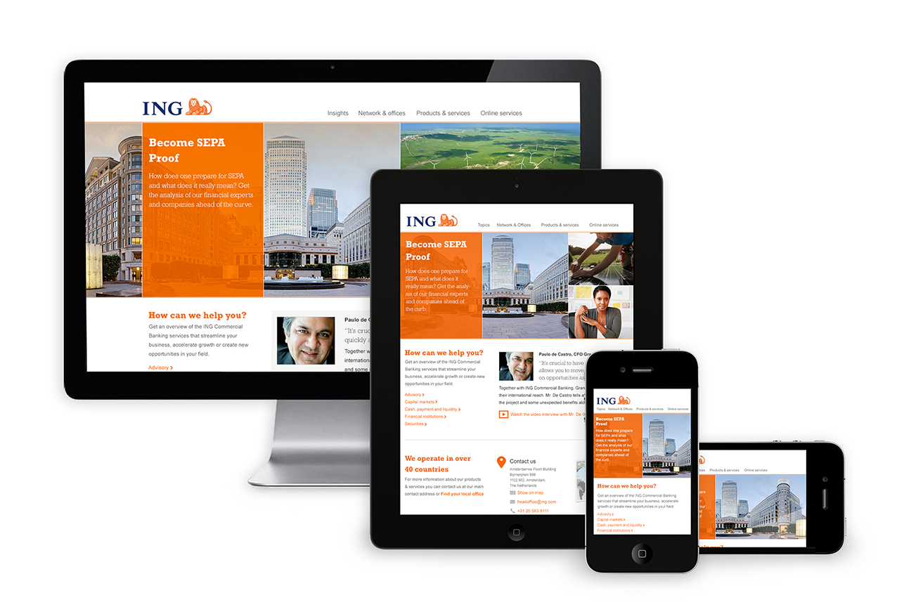
Finished work
Homepage

Topics page

Country page

Product page

__________________________________________________
CREDITS
Product owner
Cees Moens
Creative Consultant
Robert de Blok
Content Consultant
Peet Sneekes
Art Director
Bob Vermeersch
Visual Designer
Edwin van Maanen
Project Manager
Laura Verstraaten