Remastering the experience
hoyhoy.nl
The assignment
Hoyhoy, the insurance comparison site, was investing a lot in TV airtime, but did not see an increase in conversion. They asked us to redesign their site to create the perfect the user experience.

Product vision statement
“Making people’s financial descisions surprisingly easy”

Approach
Simplicity first
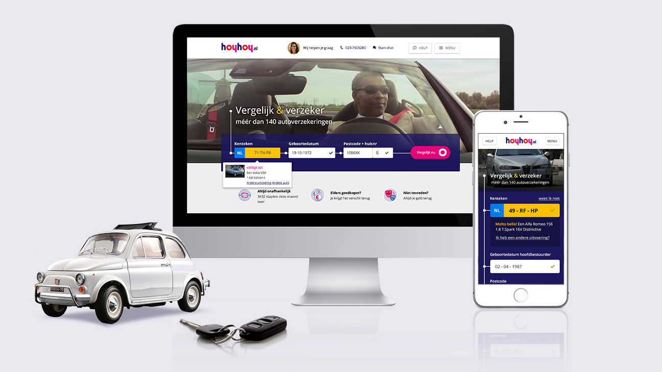
The goal was to design mobile first. The biggest advantage of this approach is the focus on task completion. By using off-canvas panels, the needed content is always available and relevant to the current page. The result is a simple interface which guides you through the flow without any distractions.


Connecting the dots
Acting on a dutch saying, “Act normal, you’re already crazy enough.”, the inverted logo was put back right side up. The new design got a dark colored background to add contrast to the interface and focus on the input fields. Based on the ‘animate to educate’ principle, we added an animated line with stops to guide you through the process.

As an addition to the visual style, we created a custom set of icons, varying from simple two-tones to complete illustrations.
Camera rolling, and …. action!
Cherry on the cake was the use of film in the header. We wrote 4 scripts to aspire to the feeling of going on the road well insured. With the help of photographer Arno Bosma we turned them into 4 video animations to augment the user experience, without distracting them from the main task.

Finished work
Mobile homepage & product page

Desktop homepage

Desktop product page

The encore
After the succesful launch of the car funnel (and a big increase in the Net Conversion Rate), it was time to take on the health insurance funnel. To make the experience personal again, we asked Pixelkaiju to design some avatars, based on 8 predefined age segments. We also wrote 4 scripts around the concept of health, which again were shot by photographer Arno Bosma.
Desktop product page

Desktop coverage page

__________________________________________________
CREDITS
Creative Director
Emiel Nawijn
Art Director
Bob Vermeersch
Interaction Designer
Paul van de Woestijne
Visual Designer
Mohamed El Hachmioui
Product Owner
Arthur Prinssen
Scrum Master
Annemiek van den Hoven
Photographer
Arno Bosma
Illustrator
Pixelkaiju

